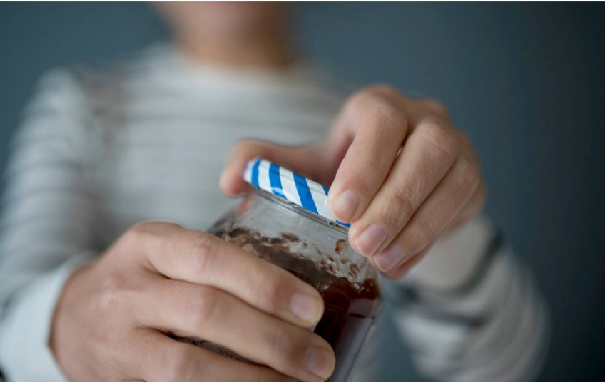
Designing packages that are easier to read, open, and use for the blind and disabled ultimately improves the user experience for all. For a person without disabilities, opening a tightly wrapped cardboard box can take effort. For those with reduced dexterity, it is more than a nuisance, it is almost impossible. Those who have complete vision can distinguish between two identically shaped bottles that feature different labels, while those who are visually impaired will have difficulty. Therefore, this article will discuss the processes that designers follow to make simple packaging so that people with disabilities do not have difficulties.
Easy Open Machine
When designing a package, it is best to try to incorporate different ways to open it. A package that features multiple mechanisms, including loops, hinges, and slide-out trays, will be much easier to open than a package that can only be opened one way. Accessible packaging gives the customer as many options as possible. If the customer has a hard time opening the package one way, he or she will have multiple other avenues to try.

Using Symbols, Rather Than Braille
Morg Latif follows the principle of designing packages for everyone. Last year, Latif relaunched Herbal Essences’ bottles featuring tactile marks that help blind people distinguish them by touch by incorporating stripes on shampoo bottles and circles on conditioner bottles. A simple code like this is better than using braille, she says, which can take years to learn and is not used by all blind people, while shapes are accessible to everyone.
The marks also help anyone who wears glasses or contact lenses and has blurry vision in the shower. “Until now, packaging has been dependent on vision,” Latif says. “We need to think about how to bring in other senses to enhance user experience.”

Using Braille may seem like a solution here, but Latif recognized that a very limited number of people who are blind or visually impaired are Braille users. “Most people with visual impairments cannot read Braille – it takes months, if not years to learn, and really you have to start young to develop the sensitivity. Most people develop visual impairments in later life, and Braille is no longer an option,” says Latif. “It was important that we invent a feature which could be universally recognized and would work for people who haven’t had the opportunity to learn Braille.”
By choosing a simple, more universal approach to differentiate the bottles, P&G hopes to make the bottle more accessible, not just to those with a visual impairment, but for anyone who may struggle to tell the products apart during use.
Legibility and High-Contrast Graphics
Some designers are still focusing on how to make packaging as visually clear as possible, given that many sight-impaired people are not fully blind. Certain graphic design features can increase legibility, says Mr. Thomas at Jones Knowles Ritchie, such as high-contrast colors, sans-serif typefaces in large font sizes, and shapes.
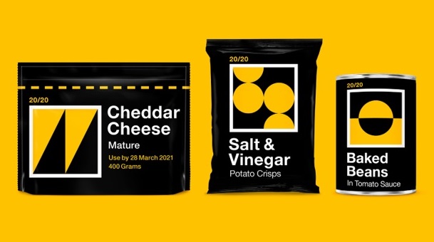
This idea formed a food packaging concept, which the design studio has developed alongside Revolt Communications. Vision 20/20 is a set of packets, which are black and yellow, feature a large Helvetica font, and use shapes, such as circles and triangles, to indicate different foods. The shapes are easier to spot on the shelf or in a dark cupboard, says Mr. Thomas, and could be used as “giant QR codes”, so they would be scanned into an app that would read out information.
For example
People with disabilities are the largest minority group in the world. In the United States alone, one in four people has a disability, yet beauty and personal care products often overlook their challenges and needs. As the world's number one deodorant and antiperspirant brand, Degree is taking steps to change this. Degree believes that the movement has the power to transform lives and that everyone should be able to experience the incredible physical, mental, and social benefits it can provide, whoever and however they want.
Limited eyesight or arm mobility can make twisting a deodorant cap, twirling a bar, or pressing a spray challenging, and sometimes fear of sweating without antiperspirant protection can prevent people with disabilities from moving around as much as they wish. That is why Degree has worked with a diverse team of experts to put the specific needs of consumers with disabilities at the forefront of a new concept: Degree Inclusive, the world's first adaptive deodorant.
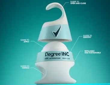
Refillable packaging for the new Degree Inclusive deodorant is easy to open and apply for people with visual impairment and upper limb motor disabilities. Sure Deodorant, makers of the world's number one antiperspirant, has launched a new trial to develop the world's first inclusive deodorant for the visually impaired and upper extremity motor impairments. The test will see Sure work with the disabled community to test a new prototype design called Sure Inclusive.
Marking the beginning of the brand's journey to accessible design, the Sure Inclusive prototype has been tested by a diverse community of engineers, design experts, occupational therapists, and disabled consumers to develop a one-of-a-kind product innovation that was introduced in US hearings. The trial is expected to begin in the UK in August 2021.
More than one in five Britons have a disability, but many products and experiences are not designed with this community in mind. In the beauty and personal care industry, there is currently no deodorant product specifically designed for use by people with upper extremity disabilities; twisting a deodorant cap, twirling a stick, or pushing down an aerosol can with limited arm mobility can be a real challenge. Driven by the mission to make the deodorant application process more accessible to everyone, Sure Inclusive is the world's first adaptive deodorant and has been designed with the following revolutionary features:
- A hook-shaped design for one-handed use
- Magnetic closures make it easy to remove the cap and replace it for users with limited grip and / or vision problems.
- Improved grip placement for easier application for users with limited grip or no arms
- A braille label with instructions for visually impaired users.
- A larger roller applicator to achieve more surface area per pass.
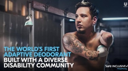
In partnership with the Muscular Dystrophy Association, non-profit organizations Open Style Lab and The Lighthouse Chicago, and a panel of engineers, designers, and occupational therapists, Degree invited 200 consumers with a range of physical disabilities to trial its prototype roll-on. Their feedback will be applied to help improve the product for its future commercial launch.
Kathryn Swallow, Global Degree Brand Vice President, said, “As a brand that’s committed to inspiring confidence in everyone to move more, Degree believes no one should be held back from breaking a sweat and enjoying the transformative benefits of movement.” Kathryn Swallow also said, “More than 60 million people in the US live with a disability, yet products and experiences are still not designed with this community in mind. With Degree Inclusive, we hope to inspire bold action across the industry to ensure that people with disabilities have an equal playing field.”
References
CSR — MORGAN LATIF
Beauty is designing packaging for the visually impaired | Vogue Business
P&G Chooses D-Series for Accessible Tactile Labelling | Domino North America (domino-printing.com)
The importance of accessible packaging | New Pelican
The world’s first deodorant designed for people with disabilities | News | Unilever global company website

