What is nostalgia, and what does it have to with packaging as a whole? Nostalgia as defined by Merriam-Webster, “A wistful or excessively yearning for return to or of some past period or irrecoverable condition.” Despite our current era being one of high technology and many products being better than ever before, we tend to want to go back to good old days. Hindsight is 20/20 as they say and often rose tinted as well. Design is a cycle, for every couple of years of change, it eventually loops back onto old trends, familiar colors and concepts. Nostalgia is quickly becoming a powerful tool to lure in customers. Often in packaging we tend to overlook the sell component of the boxes and containers that we create. It is not enough for the goods within to be protected, the goods themselves must be sold from the packaging’s design. Nostalgia is a tool that can be employed to great effect in packaging. It creates a sense of quality and durability. Nostalgia invokes strong emotional responses from viewers that cannot be simply matched by other techniques. It used to be that nostalgia was a negative feeling commonly associated with being homesick, in fact the term was termed to describe home-sick soldier kept from their homelands by the ravages of war. Today the connotation surrounding the term has become much friendlier and acceptable in society.
Nostalgic packaging or as it is better known, throw-back packaging focuses on colorful illustrations and simple color schemes. It wants to trigger a strong emotional response associated with past memories of consumers. Often these are calls to the strongly held belief of many that products were of higher quality in the past. A popular example is the idea that high fructose corn syrup soft drinks taste worse than the ones sweetened by sugar as they once were. This is demonstrated by brands such as Pepsi bringing back the sugar sweetened drinks and even going as far as recreating the original packaging. This impact is two-fold, consumers yearn for the higher quality products of the past, and those that don’t, are drawn in by the simple and colorful design of the packaging. By utilizing this old timey packaging Pepsi also establishes itself aa long-time player in the game. Pepsi has been making drinks for longer than most, this longevity is often attributed by the general public as a sign of the quality of the product. In the case of a relatively new company, said retro packaging can create a false sense of longevity. It is hard for most products starting out to stay around long enough to become a household name. By essentially creating false history through nostalgia, a new product gains a huge advantage.
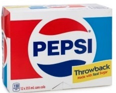
Nostalgia Packaging, sometimes called throw-back packaging on a box of Pepsi
(https://storage.googleapis.com/images-sof-prd-9fa6b8b.sof.prd.v8.commerce.mi9cloud.com/product-images/zoom/00069000010891.jpg)
In the pandemic time, many found themselves with a lot more time for self-reflection and yearning. Many reflected on their emotional and physical state. With this new mindscape, many wished to go back to the times before the pandemic and escape their current woes. Therefore, we are experiencing a retro renaissance. Every company must appeal to the target audience to survive. There are many of what I like to call legacy customers, that is customers that are already loyal to a brand. If a company wants to not only survive, but also grow, they must appeal and draw in new customers to fuel their growth. To do this one must follow the trends, which right now calls for designs that recall the golden past. Periods where we only remember or want to only remember the good.
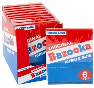
Another example of Nostalgic Packaging
(https://res.cloudinary.com/nassau-candy/image/upload/c_fit,w_1000,h_1000,f_auto/v1539900025/40640.jpg)
Another reason the pandemic has led the market to prefer nostalgic packaging is the disconnect from technology that it instills. In the post covid world, we are more connected than ever to the world. Work from home, zoom rooms and always being connected for the better part of the last few years has begun to exact its toll on many of us. Nostalgia reminds of the simpler times when we were free from our technological shackles and more connected to people. Products in this throw-back packaging allow us to disconnect, if only for a moment from our daily lives. They appeal to the sense that things used to be better.

Vintage Packaging
(https://www.industrialpackaging.com/hs-fs/hubfs/Vintage%20gift.jpeg?width=900&name=Vintage%20gift.jpeg)
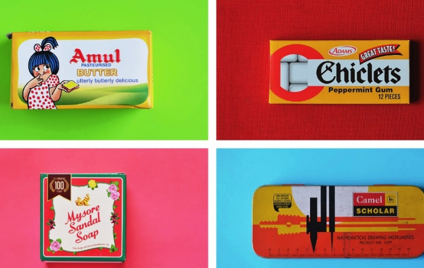
Vintage design is new method of demonstrating dedication to a higher standard of quality, oftentimes untouched since the inception of the product. It tells the story long standing tradition, respect to customers, and a strong sense of passion. Vintage design elements denote that your product is a premium good, even if it may not truly be. They allow you to create a strong and unique sense of brand identity, distinguishing your products from their neighbors of the shelves of retailers. Consumers recall heritage and personal memory when exposed to vintage packaging, which can be a driving force when picking products. This type of packaging speaks heavily of your brand; where you came from and where you are going. Just as we may celebrate special milestones in our lives, this style of packaging allows brands to celebrate special anniversaries. Throw-back packaging for a brand’s 50th anniversary not only reminds consumers of the longevity of the product, it also instills a sense of trust in consumers. While other companies have come and gone in that time, yours remains, a testament to the quality and desirability of your product and brand as a whole.
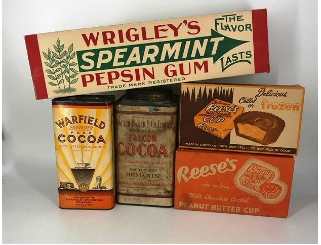
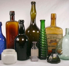
Examples of Vintage Packaging and Their Materials
(https://image.invaluable.com/housePhotos/appletreeauction/10/688910/H1072-L233646094.jpg)
Vintage packaging is not solely about the design you print on the box. Materials play a huge role in creating that ever desirable vintage feel. Packaging in the past was often bare brown cardboard with designs printed directly onto it. This has a unique rustic effect that modern packages often lack. Colors look different on bare brown cardboard. They tend to be warmer and as such, they seem more welcoming. Metal tins were also commonplace in the past. These were unique in that many were repurposed into storage containers long after the products they held were long gone. The closest analogue that remains today would be the butter cookie tins that so many repurpose into storage containers for small items. Twine was often used to ensure that these packages stayed closed and intact. These packages were simple and easy to open. The materials had a unique tactility to them that made them feel substantial and quality. In today’s market where retro packaging has started to become heavily saturated, creating packages that not only look like they are retro but also feel retro is a great way to set your brand apart.
Despite the long list of benefits of nostalgic packaging, there are some reasons for why you may not want to utilize it. The chief one being that using vintage style packaging usually means that your packaging may not be as recyclable as something in a newer style. In a world where we are buying products and goods at ever faster rates, it is becoming imperative to consider the environmental impact of our actions. It is unconscionable to use nostalgia as a tool to lure consumers in while disregarding the planet that we all share. Another disadvantage may be alienating certain consumers. You must be careful in what nostalgic elements you rely on for your designs. You want potential consumers to associate your packaging with the good old days. To this end you must research the time period you are trying to bring back and ensure that there are no ill memories of it. The last thing a brand would want is to make consumers associate their product or entire brand with bitter memories. Just because vintage style packaging is in vogue in the current design meta, does not mean that it would be the best solution for your specific use case. Given the popularity of the retro styling, many product sectors are heavily saturated with this style of box. To blindly follow design trends can lead to self-harm. Remember you want your product to stand out, not blend in. To this end, you might want to tone down the retro elements, blending them with newer design principles to create something that is still reminiscent of the past. You might even have to opt for something entirely new that has no retro elements.
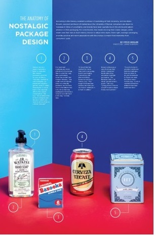
Nostalgic Design Principles
(https://www.ama.org/wp-content/uploads/2020/04/anatomyofFULL_3_WEB.jpg)
Nostalgic design in packaging has recently come into its own. Retro designs allow companies to appeal to consumers sense of nostalgia, a powerful emotion that can make the difference between your product being picked over another. In todays ever crowded product shelves, vintage packaging allows you to distinguish your product. They appeal heavily to a consumer’s emotions, creating a longing for the past, a longing that your product will satisfy. Vintage packaging is associated with bright and simple designs that harken back to the way things used to be. This style of design suggests quality and longevity. Old style packages are often seen as more approachable and more likely to be noticed among the sea of many competing products. Nostalgia is a powerful design element that has only recently been employed to any meaningful extent. The power of nostalgia in package design has yet to been fully explored, and will only grow in the coming years.
References
https://www.pointbleudesign.com/blog/packaging-design-trend-70s-nostalgia/
https://tinwaredirect.com/blogs/tips-advice/what-impact-can-nostalgia-have-on-sales
https://www.packagingstrategies.com/articles/93804-nostalgic-packaging-has-made-a-comeback
https://www.industrialpackaging.com/blog/vintage-packaging-unboxing-nostalgia
https://www.industrialpackaging.com/blog/vintage-packaging-unboxing-nostalgia
https://99designs.com/blog/trends/packaging-design-trends-2018/#vintage


